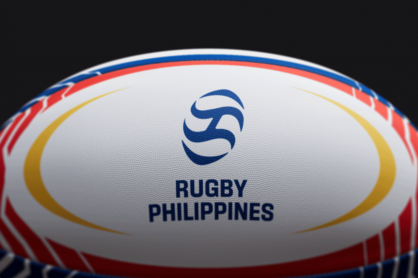
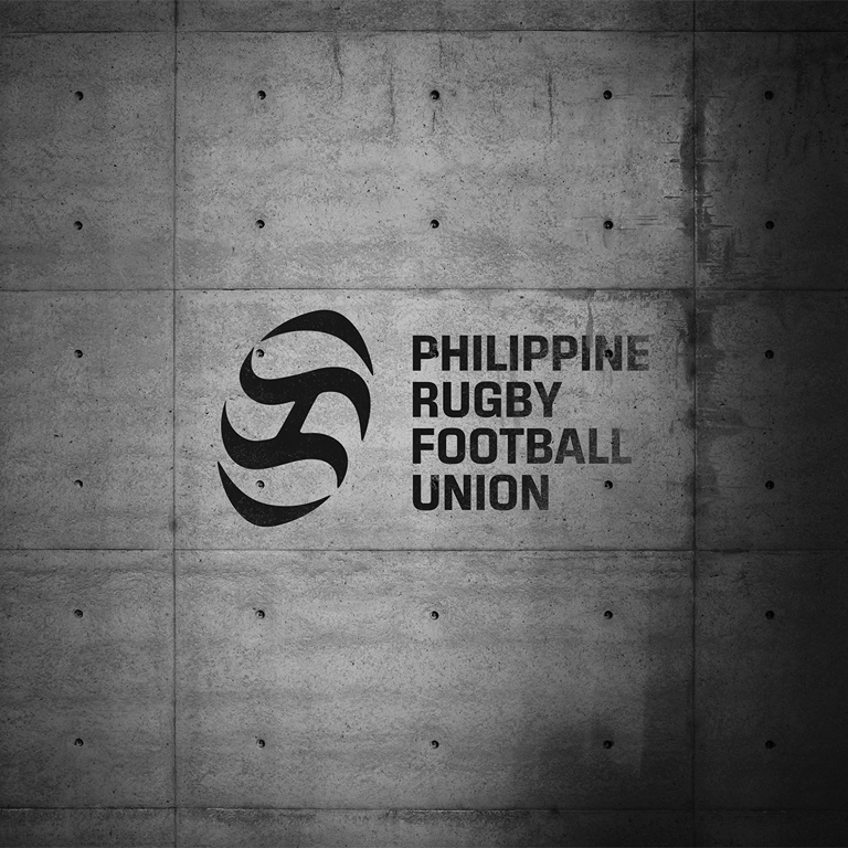
Rugby Philippines
Brand Identity
Brand Strategy
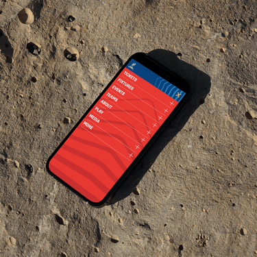
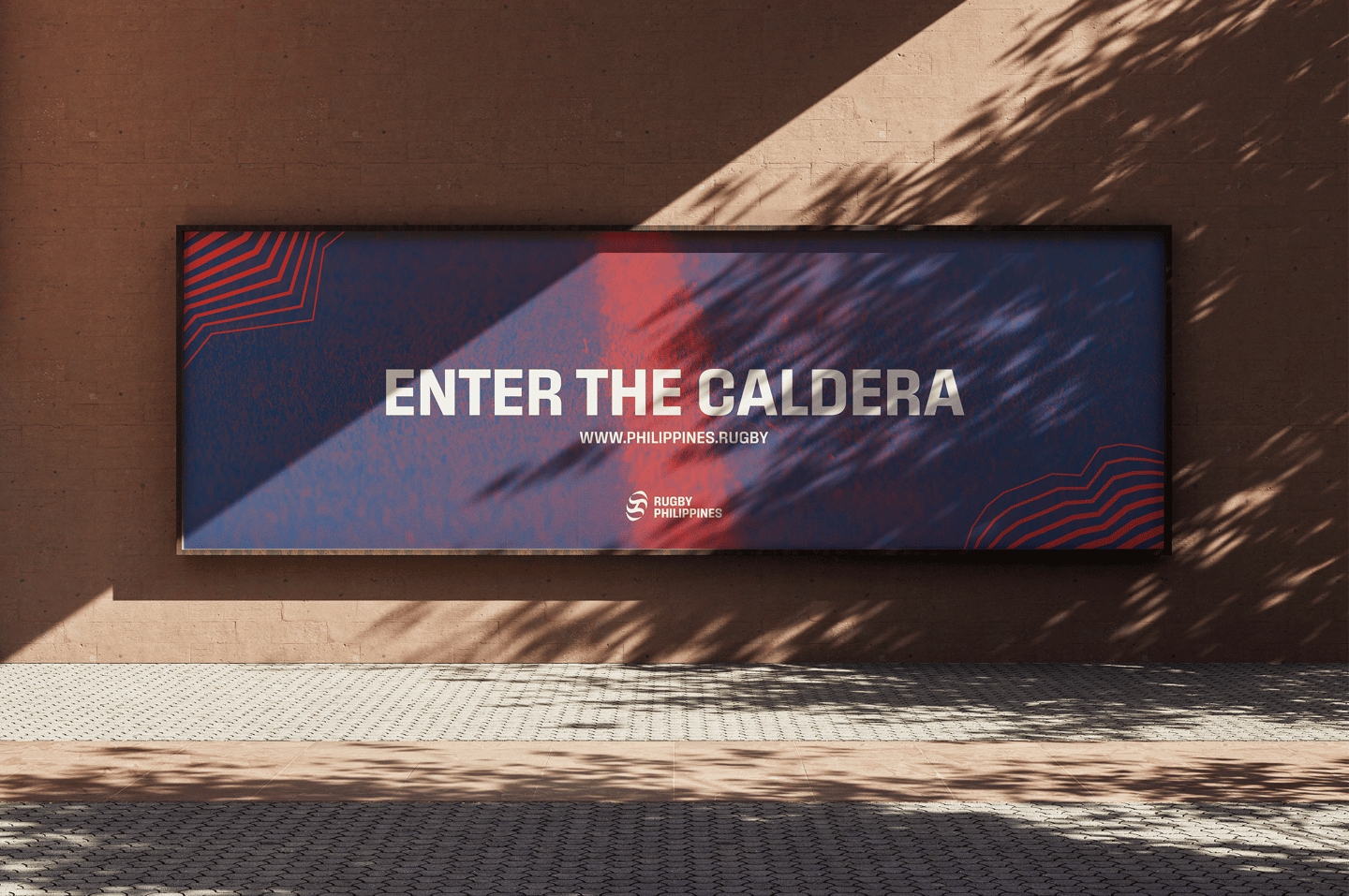
Campaign Design
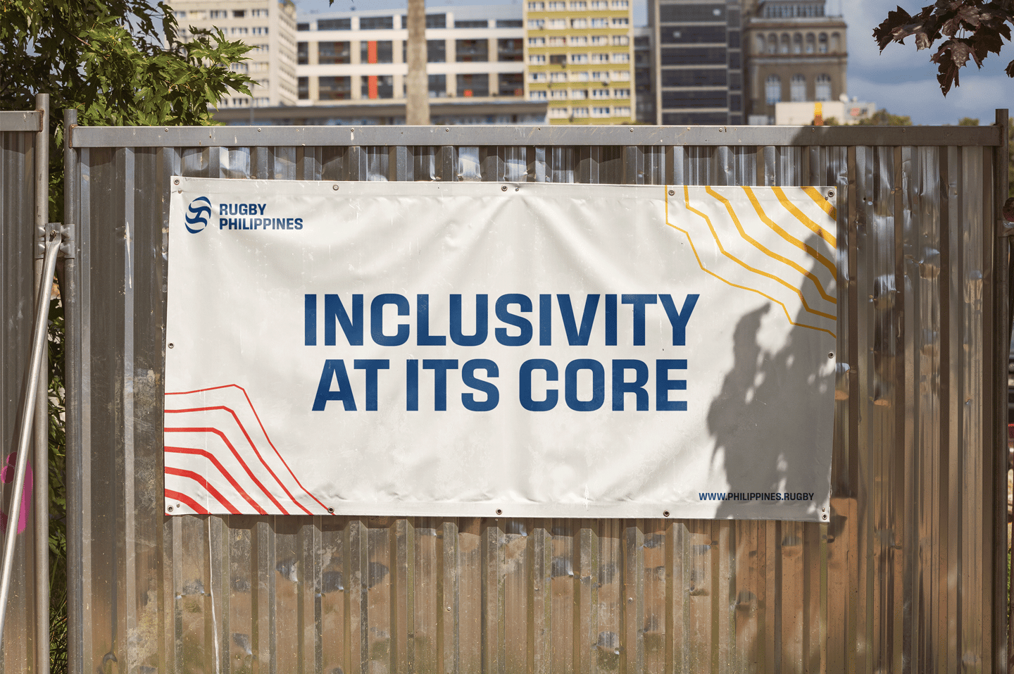
This personal project aimed to create a brand identity for the Philippine Rugby Football Union (PRFU) that struck a balance between inclusive, dynamic and professional. It integrates traditional elements as well as modern designs ranging from the use of the volcanic landmarks, ancient ‘Baybayin’ script and national symbolism. The foundational graphic element is the use of contour lines to represent the most prominent volcanoes and mountains of the country. Made up of eight lines, it also represents the rays of the Philippine flag and the ever-growing nature of the sport. These lines also represent the foundational vision of the union; to watch, play and grow the sport of rugby.


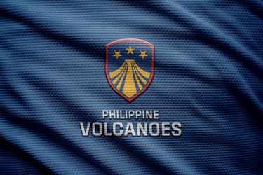
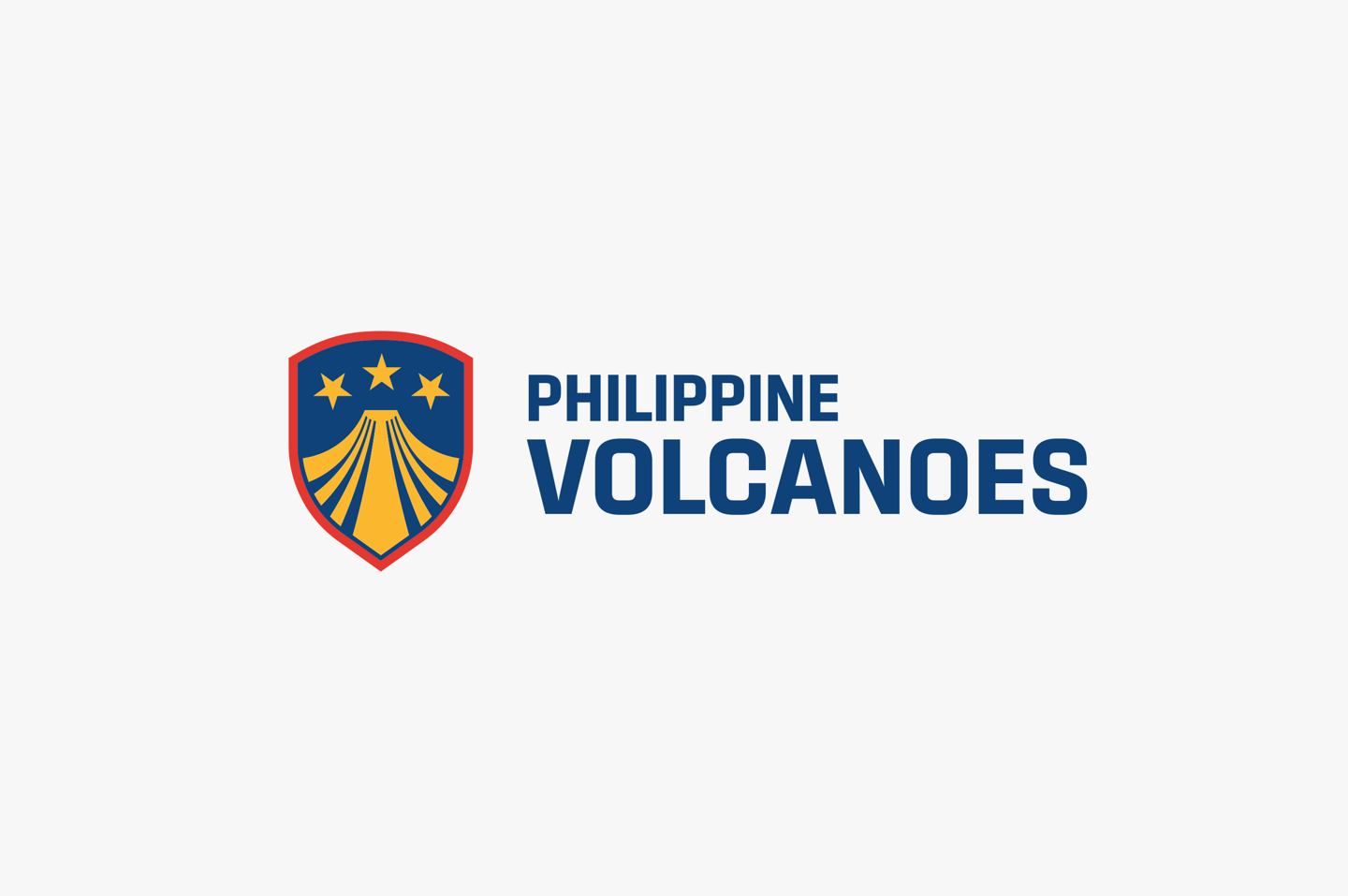


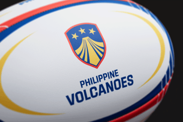
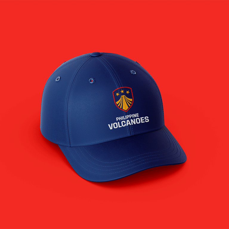
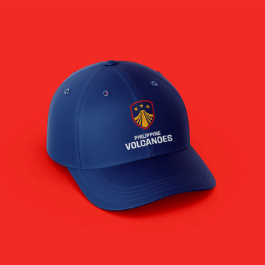
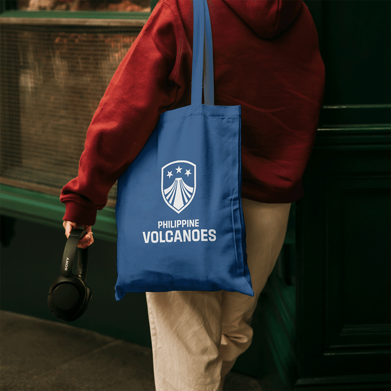
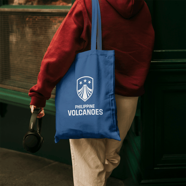
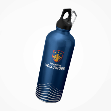
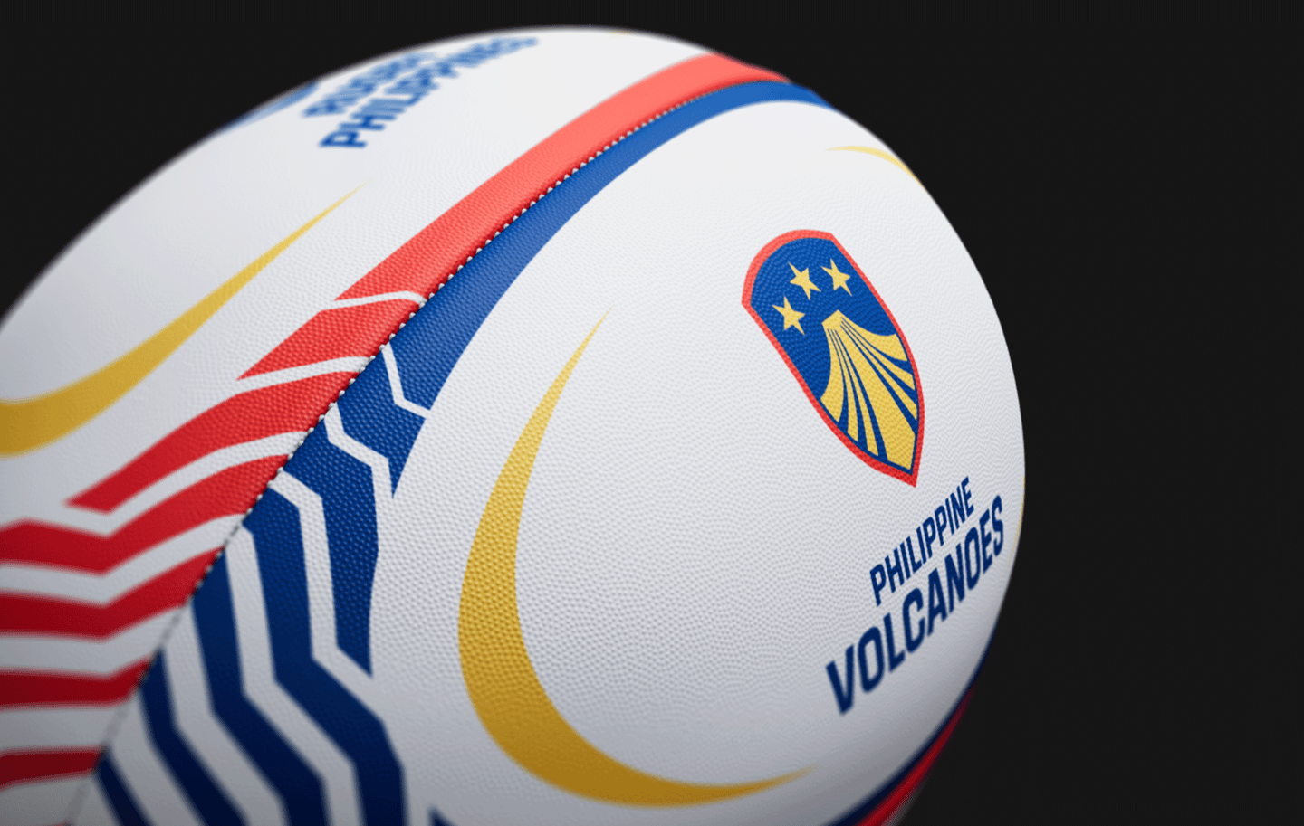
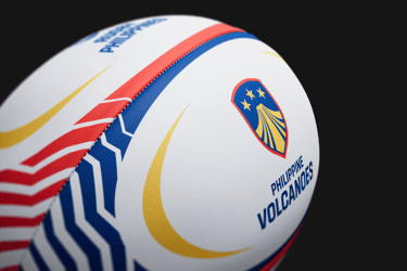
This identity is shared with the national team of the union, the Philippine Volcanoes. The new logo respects the core iconography of the original whilst injecting a new sense of fiery energy. Combining the rays of the sun with the upward form of a stratovolcano to give the stars more energy. The shield harkens back to the inception of the national rugby team, originally named after the 1st Filipino Infantry Regiment.